Harry Potter books - the whole set. Gee thanks Canada for your third-rate cartoon drawings, especially the Deathly Hallows cover. The last cover, considered to be the most compelling and serious of the books, has Hermione vomiting out lava with two fat red squirrel cheeks, Ron's face so sallow he looks like he is recovering from a drinking problem, and Harry is a 45 year old man. Where is the quality control on that baby? Also, is the most important aspect of that book the 15 page section where they are in the vault with jewels? No. Thanks for illustrating the most insignificant of storylines.


Next we have the Hunger Games Trilogy. Although quite similar, I think you can see sometimes less really is more. Poor font choice and cheesy added background graphics make the Canadian versions not only less appealing but a repellent to the reader. Luckily this book had decent writing, otherwise Suzanne Collins might have only had a purely British (and Canadian immigrant) fan base. The black background of the British versions, link all the books together but also sets them apart with their striking singular image and colour scheme.

 |
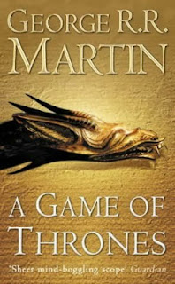
Finally, the Game of Thrones book aka Song of Fire and Ice series. Although very similar again, one book looks like it was made by me in 9th grade computers class and the other by a gifted marketing guru. The plain orange background reminds me of hospital walls, with the white strip of light guiding me into the afterlife. And thanks for terrible font choice once again. Is this 1970? If not, clean up your act and get with it. Also, the entirely wrong image is chosen to be the focal point of the cover, especially with art skills as bad as this one. Figure it out. The British cover has a textured background which is epic because of the plain colouring, and again a great text choice and colouring. The dragon symbol has advanced with the times (unlike the wolf circa 1998....before common era) and all the colours blend together. Winner winner chicken dinner.


So hopefully you have a little more insight as to the number of reasons I am staying in this country besides occupation, love, and travelling - book covers.
Tip of the cover to you Katie. Well written.
ReplyDeleteQuill and Quire - a renowned Canadian publishing journal - has a page in each publiication, of a book cover for a specific book from inception to completion and the process behind the final cover choice. They should use some of your inspiration.